Styles
The component’s baseline stylesheet, derived from what Figma applied: a rule per anatomy element, token references as var(--), and a selector per variant. React emits one file, styles.css. Web Components emits two — host.css and light.css — because a shadow boundary means one file cannot do both jobs.
Shape
/* Generated. Do not edit — regenerate with `specs react`. */
@layer specs {
.alert, .alert * {  box-sizing: border-box;}
.alert {  display: flex;  flex-direction: row;  align-items: flex-start;  gap: var(--space-3);  padding: var(--space-4) var(--space-6);  background: var(--color-surface-neutral);  border-radius: var(--radius-lg);}
.alert__icon {  flex-shrink: 0;  width: var(--size-icon-md);  height: var(--size-icon-md);  fill: var(--color-icon-neutral);}
/* Variant: severity */
.alert[data-severity="warning"] {  background: var(--color-surface-warning);}
.alert[data-severity="warning"] .alert__icon {  fill: var(--color-icon-warning);}
/* Compound variant: severity + dismissible */
.alert[data-severity="error"][data-dismissible] .alert__icon {  fill: var(--color-icon-error-strong);}
}| Emitted | Rule |
|---|---|
.component | The root, the component’s key kebab-cased |
.component__element | A child, BEM-suffixed with its anatomy name |
[data-prop] | A boolean variant prop — presence, not value |
[data-prop="value"] | An enum variant prop, prop name kebabized |
[data-a][data-b] | A compound variant, for intersection overrides |
@layer specs { … } | Everything, so a consumer’s unlayered CSS wins without a specificity fight |
The data-* attributes here are exactly what the scaffold writes on the root.
The Web Components split
host.css styles the element itself and its shadow-root children — the same content as the React sheet, with :host in place of the root class.
:host, :host * { box-sizing: border-box; }
:host {  display: flex;  flex-direction: row;  gap: var(--space-2);}
.alert__icon { … }
light.css styles content a consumer slots in, which the shadow root cannot reach. It selects the tag from the light DOM instead of :host, and it is a plain import, not part of the element’s adopted styles.
ui-alert, ui-alert * { box-sizing: border-box; }The split is not a preference. A single file would silently fail on whichever side it was not written for.
Token resolution
Token references become var(--) names according to spec.tokens in config/settings.yaml.
| Format | Resolution |
|---|---|
TOKEN / TOKEN_NAME / FIGMA_NAME / TOKEN_FIGMA_EXTENSIONS | Path-derived kebab variable: Color/Surface/Neutral → var(--color-surface-neutral) |
FIGMA_SYNTAX_WEB | The spec value is already the CSS var name — used verbatim |
CUSTOM | $cssVar when present, otherwise path derivation |
FIGMA_SYNTAX_IOS / FIGMA_SYNTAX_ANDROID | Path derivation fallback |
What those names resolve against is cssvars.css. See the tokens setting.
State selectors
With no states convention configured, every variant prop produces a [data-*] selector. Configured, a classified prop emits the semantic pseudo-class or ARIA selector instead.
A favourite button with state (Rest, Hover, Pressed), selected and disabled classified emits no data-* at all:
/* Variant: disabled */.favorite-button:disabled {  opacity: 0.36;}
/* Variant: state=Hover — hover */.favorite-button:hover:not(:disabled) .favorite-button__hover {  display: block;}
/* Variant: state=Pressed — hover */.favorite-button:active:not(:disabled) .favorite-button__hover {  inset-block-start: 2px;  inset-inline-start: 2px;  display: block;}
/* Variant: selected — icon */.favorite-button[aria-pressed="true"] .favorite-button__icon {  background-color: var(--palette-red-58);}
Three axes, three different selector kinds: a pseudo-class the browser owns, a pseudo-class the pointer drives, and an ARIA attribute the component writes. Which prop maps to which is the convention’s to declare, and the comment above each block names the variant it came from so the mapping stays legible.
The :not(:disabled) on the hover and active blocks is added automatically wherever a disabled concept is configured — every :hover and :active selector gets it, including compound selectors that mix a data attribute with one of them. Hover styles do not fire on a disabled control, with no extra CSS to write. When disabled is expressed with ARIA rather than the native attribute, the guard is :not(:disabled):not([aria-disabled="true"]).
Selectors that are not :hover or :active — :focus-within, :disabled itself — are never guarded.
Structural fixes
Two adjustments come from comparing the default layout against every variant layout. Neither is configurable, because neither is a preference.
Structurally-absent elements. An element a variant includes but the default omits is hidden at the base and un-hidden under the variants that include it. The favourite button’s hover wash exists only in two of its twelve cells:
.favorite-button__hover {  background: var(--color-action-press);  opacity: 0.1;  position: absolute;  inset: 0;  display: none;}
.favorite-button:hover:not(:disabled) .favorite-button__hover { display: block; }.favorite-button:active:not(:disabled) .favorite-button__hover { display: block; }
Stacking and containing blocks. An absolutely-positioned element needs its layout parent to establish a containing block, or its offsets resolve against the viewport. That parent gets position: relative. So do the absolute element’s non-absolute siblings — without it, the absolute element paints above them regardless of Figma layer order, since only positioned elements participate in DOM paint sequence.
.badge__container { position: relative; } /* containing block for .badge__dot */.badge__label { position: relative; } /* keeps layer order vs. the absolute dot */position: relative is added only when the element does not already declare its own position.
What a role adds to the sheet
A role changes the element the scaffold emits, which leaves the stylesheet with two problems Figma cannot describe. Both are solved in the sheet rather than in the markup.
The user agent’s own styling. A togglebutton role emits a real <button>, and a <button> arrives with a border, a background, a font and a text alignment nobody asked for. Figma’s fill and radius would be layered on top of them:
/* togglebutton role: neutralize user-agent styling for the emitted element. */.favorite-button { appearance: none; -webkit-appearance: none; background: none; border: 0; margin: 0; padding: 0; font: inherit; color: inherit; text-align: inherit;}It is emitted before the component’s own rules, so anything the spec does declare still wins.
Affordances the design file has no way to hold. Figma has no cursor. When the states convention names a press or a disabled concept, the component is known to be interactive, and the sheet says so:
/* Press affordance: the states convention names an active or pressed concept, so this is a press target. Figma has no cursor. */.favorite-button { cursor: pointer; }
/* Disabled affordance: the states convention names a disabled concept. */.favorite-button:disabled { cursor: not-allowed; }
Each carries the reason in a comment, because a rule with no source in the spec is otherwise indistinguishable from a hand edit.
Source
Specs
Every rule above traces to variants.yaml — the per-variant styling — except the role and affordance blocks, which come from anatomy in api.yaml:
anatomy: root: type: container role: togglebutton icon: type: glyph hover: type: container detectedIn: Selected=false, State=Hover, Disabled=falsedetectedIn is what makes .favorite-button__hover structurally absent: the element was found in one variant and not the default, so the sheet hides it and un-hides it exactly there.
Figma
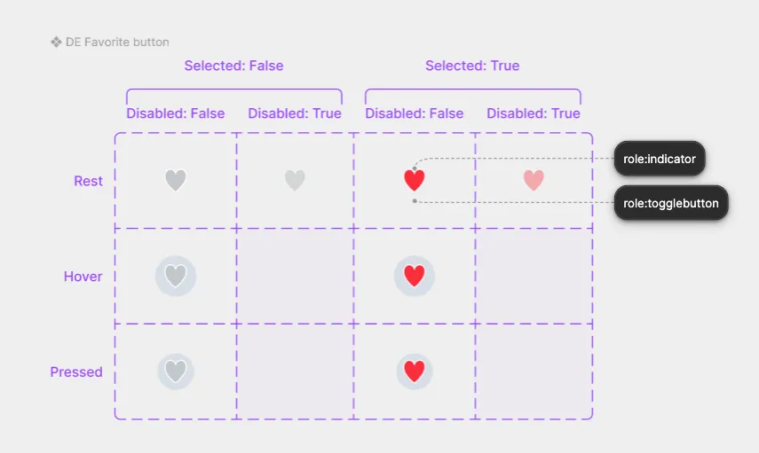
The matrix is the source of every variant block on this page. What it does not contain is the cursor, the user-agent reset, or the :not(:disabled) guard — all three are consequences of the emitted element being a real control, which is a fact about the role rather than about the artwork.
Subcomponents
A subcomponent gets its own stylesheet in its own directory, scoped to its own key — .checkbox-control, not the parent’s class. Parent elements and parent variants never appear in it, so the file is complete on its own and a subcomponent used elsewhere still styles correctly.
See Also
- CSS variables — what these
var()references resolve against - Scaffold — where the class names and data attributes are written
statesconvention — classify variant props as semantic states- tokens setting — how token names are derived