Stories
A Storybook CSF file per component — stories.tsx for React, stories.ts for Web Components. Controls are typed from the contract, one story is emitted per variant axis, and a sticker sheet renders every axis on one page.
For a component with slots, that is the smaller half of the file. The larger half is one story per ready-made example — a real composition the designer assembled in Figma, emitted as real markup calling real components.
Stories are emitted by default. --no-stories omits them, for a consumer who does not use Storybook.
React
A card: one appearance enum, one slot, and seven ready-made examples.
// Generated. Do not edit — regenerate with `specs react`.import type { Meta, StoryObj } from '@storybook/react';import * as React from 'react';import { Card } from './scaffold';import { CardDefaults } from './contract';import { Image } from '../Image/scaffold';import { Layout } from '../Layout/scaffold';import { Title } from '../Title/scaffold';import { Text } from '../Text/scaffold';import { Reviews } from './Reviews/scaffold';import { IconList } from '../IconList/scaffold';import { Badge } from '../Badge/scaffold';import { Link } from '../Link/scaffold';
const meta = {  title: 'React/Card',  parameters: { layout: 'padded' },  decorators: [(Story: React.ComponentType) => <div style={{ width: 375 }}><Story /></div>],  component: Card,  argTypes: {    appearance: { control: 'select', options: ["primary","secondary","low contrast"], table: { defaultValue: { summary: "primary" } } },    children: { control: false },  },  args: {    ...CardDefaults,    appearance: "secondary",  },  render: (args) => (    <Card {...args}>        {/* children: instanceExamples/cardExamplesBasic → slotContentExamples/cardExamplesBasic__children */}        <Image imageSource="/assets/images/sunrise.jpg" accessibilityLabel="Ocean sunrise with moon visible" aspectRatio="16:9" />        <Layout direction="vertical" itemSpacing="0_5x" padding="1x">              <Layout direction="vertical" itemSpacing="0_25x">                    <Title size={5} color="primary" resizing="fill" text="Haleakala Sunrise Hike" />                    <Text size="medium" color="secondary" resizing="fill" text="Maui, Hawaii" />              </Layout>        </Layout>    </Card>  ),} satisfies Meta<typeof Card>;
export default meta;type Story = StoryObj<typeof meta>;
export const Default: Story = {};
export const Offer1: Story = {  args: { appearance: "secondary" },  render: (args) => (    <Card {...args}>        {/* children: instanceExamples/cardExamplesOffer1 → slotContentExamples/cardExamplesOffer1__children */}        …    </Card>  ),};
export const Reviews: Story = { /* … */ };export const ReviewsAndIconList: Story = { /* … */ };
export const ContractDefault: Story = { args: { ...CardDefaults } };export const AppearanceSecondary: Story = { args: { appearance: "secondary" } };export const AppearanceLowcontrast: Story = { args: { appearance: "low contrast" } };| Emitted | From |
|---|---|
argTypes per prop | The contract. An enum becomes control: 'select' with its values as options; a boolean needs only its default |
children: { control: false } | A slot is not a control. Storybook would render an editable text field for it otherwise |
defaultValue.summary | The defaults constant, so the panel shows what the component does with no args |
render in meta | The default composition, so every story inherits real content instead of an empty box |
A decorator constraining width | A card is a fill-width component; at full viewport width the stories would read as nothing |
| One story per ready-made example | instanceExamples — the named compositions below |
ContractDefault and one story per enum value | The variant axis, unaffected by which example is showing |
StickerSheet | Every axis on one page, grouped, with controls disabled |
| A comment above each block | The spec path it came from, so an unexpected story is traceable without guessing |
The import is the seam: the stories import ./scaffold unless an authored component.tsx sits beside it, in which case they import that instead. The stories always show what a consumer actually gets.
In Storybook
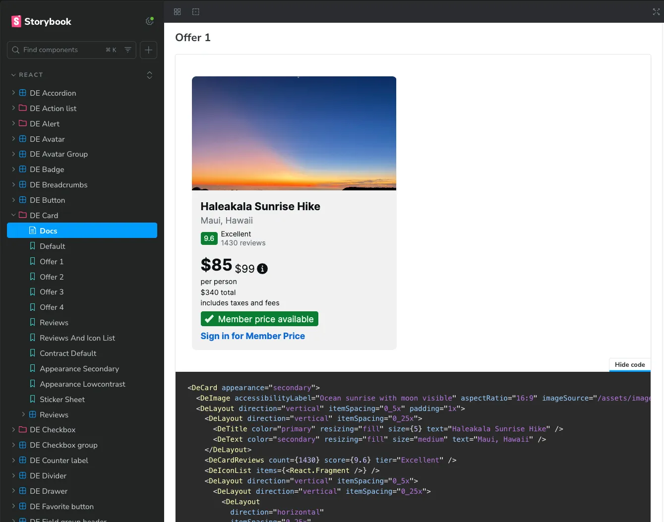
The sidebar is the file’s exports, read top to bottom. The compositions come first, the variant stories after, and the sticker sheet last — which is the order a person looks for them in, not an accident of the emitter.
| In Storybook | From the file |
|---|---|
Offer 1, Reviews, Reviews And Icon List | One instanceExamples entry each. The export name is title-cased for display, so ReviewsAndIconList reads as three words |
Contract Default, Appearance Secondary, Appearance Lowcontrast | The variant axis — every value of the appearance enum, plus the contract’s own defaults |
Sticker Sheet | All of it on one page, with controls disabled |
Docs | Storybook’s own, built from the CSF. The argTypes become its props table |
A nested Reviews entry | A subcomponent with its own stories file, sitting under its parent exactly as its spec sits under the parent’s spec folder |
Show code is worth opening. It prints the story’s markup — the same composition the emitter wrote, with every prop it pinned — so a consumer can read a card they like, copy the JSX, and have a working starting point without opening the spec or the design file. That is the shortest path from a design decision to code in someone’s editor, and nothing in it was typed by hand.
Storybook is not part of the target. It reads the emitted trees from a project of its own, so a library that does not use Storybook passes --no-stories and loses nothing else.
Source
Specs
Two blocks in examples.yaml do this work, and the split between them matters.
instanceExamples are instances of this component — each one a name, the props it pins, and a reference to its content:
instanceExamples: cardExamplesBasic: title: Card / Examples / Basic propConfigurations: appearance: Secondary children: $slotContent: "#/components/card/slotContentExamples/cardExamplesBasic__children" cardExamplesOffer1: title: Card / Examples / Offer 1 propConfigurations: appearance: Secondary children: $slotContent: "#/components/card/slotContentExamples/cardExamplesOffer1__children" cardExamplesReviews: …slotContentExamples holds what was slotted into it — other components, their props, and their own nesting:
slotContentExamples: cardExamplesBasic__children: elements: image: instanceOf: image propConfigurations: imageSource: "#/components/card/images/card__root" aspectRatio: 16:9 content: instanceOf: layout propConfigurations: direction: VERTICAL padding: 1x children: $slotContent: "#/components/card/slotContentExamples/card__content__children" layout: [image, content]| Spec field | Effect on the stories |
|---|---|
An instanceExamples key | One named story. cardExamplesOffer1 becomes Offer1 |
title | Where the example sits in the Figma file, kept for traceability |
propConfigurations | The story’s args |
$slotContent | The reference followed to build the story’s render markup |
instanceOf in slot content | Which component to import and call — every import at the top of the file arrived this way |
A nested $slotContent | Followed too, which is how a card’s content renders a layout that renders a title |
The first instanceExamples entry is also what meta.render uses, so the default story is a real card rather than an empty one.
Figma
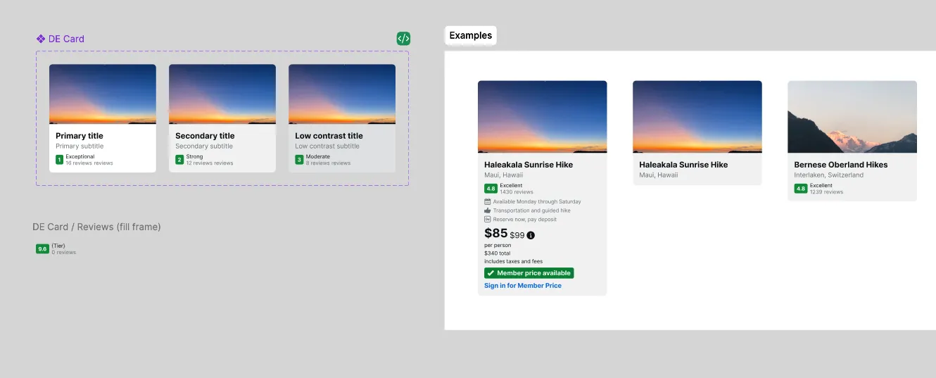
Two things in one file, and the stories need both.
- The component set, left, is the variant axis — three appearances with placeholder content. It produces
ContractDefault,AppearanceSecondaryandAppearanceLowcontrast, and nothing else. On its own it would emit three stories of an empty rectangle - The Examples frame, right, is the ready-made examples — real photography, real copy, review scores, an amenity list, a price with a member call to action. Each is one
instanceExamplesentry, and each becomes one story
The compositions are the point. A consumer evaluating a card wants to see the card someone actually shipped, not the shell it was built from — and those compositions already exist in the design file, drawn by the person who knew what the component was for. Ready-made examples covers how they are detected and named.
A component with no examples frame still gets its variant stories. It just gets nothing else.
Web Components
The same file, adapted to how Lit renders. Stories are render functions returning a template rather than a component reference, and each composed child is imported for its side effect — defining the tag — rather than for a symbol.
import type { Meta, StoryObj } from '@storybook/react';import { html } from 'lit';import './scaffold';import '../Image/scaffold';import '../Layout/scaffold';import { CardDefaults } from './contract';The React Storybook host that lets a Lit element render inside the harness lives in storybook/lib/, not in the component tree. A Lit component library has no business importing React for a harness it never uses at runtime.
Free and Pro
Free output encodes variant, boolean and text props, with one story per variant-prop axis. Composed content, glyphs, background images, compound stories and sticker sheets require a licence.
For a card, that is most of the value of the file — the variant stories are free, the seven compositions are not.
See Also
- Contract — the enums and defaults the controls are built from
- Scaffold — what the stories import, unless you authored a sibling
- Ready-made examples — how
instanceExamplesare detected react—--no-storiesand the rest of the options