Contract
The component’s typed surface: one enum per multi-value prop, an interface that uses them, and a defaults constant. It is the only emitted file both targets share byte-for-byte, because a prop named in Figma is the same prop whichever platform renders it.
Everything else reads from here. The scaffold spreads the defaults and destructures the interface; the stories type their controls from the enums; the stylesheet’s variant selectors match the values the enums list.
Shape
// Generated. Do not edit — regenerate with `specs react`.
export type CheckboxChecked =  | 'indeterminate'  | 'unchecked'  | 'checked';export type CheckboxValidation =  | 'none'  | 'error';export type CheckboxSize =  | 'small'  | 'medium';
export interface CheckboxProps {  checked?: CheckboxChecked;  validation?: CheckboxValidation;  disabled?: boolean;  size?: CheckboxSize;  label?: string | null;  helpText?: string | null;}
export const CheckboxDefaults = {  checked: "unchecked",  validation: "none",  disabled: false,  size: "small",} satisfies CheckboxProps;
What each part comes from
| Emitted | From | Notes |
|---|---|---|
type <Component><Prop> | a variant property with more than one value | Named <Component><Prop> so two components’ size enums never collide on import |
boolean prop | a variant property with exactly two values that read as on/off | See prop naming for which pairs qualify |
string | null prop | a text or slot-bearing element | null is the absence of the content, which is how the scaffold hides the element |
<Component>Defaults | each variant property’s default value | satisfies, not as — a default outside its own enum fails to compile rather than emitting a lie |
Every prop is optional. A consumer who writes <Checkbox /> gets the defaults, and the scaffold merges them over whatever was passed.
Text props carry no default, because the default for a text slot is the spec’s example content — not a value the component should assert. The stories supply the example; a consumer supplies the real thing.
A filter, not a mirror
The contract is not the spec’s prop list re-typed. Some of what the spec records never becomes a prop, and some of what the contract declares is not in the spec at all.
A favourite button — an icon that toggles, with a disabled state and a hover treatment — has four props in its spec and a contract this size:
export interface FavoriteButtonProps {  selected?: boolean;  disabled?: boolean;  accessibilityLabel?: string | null;  /** Fires after the pressed state flips. */  onPressedChange?: (pressed: boolean) => void;  /** Called after the toggle. What a click means beyond it is the consumer's. */  onClick?: (e: React.MouseEvent) => void;}
export const FavoriteButtonDefaults = { selected: false, disabled: false,} satisfies FavoriteButtonProps;| In the spec | In the contract | Why |
|---|---|---|
selected | selected?: boolean | A two-value variant property, so a boolean rather than an enum of two |
disabled | disabled?: boolean | The same |
state: [Rest, Hover, Pressed] | nothing | The states convention classifies it. :hover and :active are the browser’s to set, so a prop for them would be a prop that lies |
accessibilityLabel | accessibilityLabel?: string | null | A text property with no layer to render — a code-only prop. It reaches the markup as an attribute, never as content |
invalidPropCombinations | nothing | Not a prop. It constrains which combinations the stories emit |
| — | onPressedChange, onClick | Not in the spec at all. The togglebutton role adds them, because a toggle with no way to observe the toggle is not a toggle |
Two defaults, not four: a prop with no default in the spec gets none here, and a code-only prop’s example content belongs to the stories rather than to the component.
Source
Specs
anatomy: root: type: container role: togglebutton icon: type: glyphprops: selected: type: boolean default: false state: type: string default: Rest enum: [Rest, Hover, Pressed] nullable: false disabled: type: boolean default: false accessibilityLabel: type: string examples: - Example label $extensions: com.figma: type: TEXT source: kind: codeOnlyProp layer: Accessibility labelinvalidPropCombinations: - state: Hover disabled: true - state: Pressed disabled: truerole: togglebutton sits in anatomy, not in props — which is why two props exist in the contract with no counterpart above them. kind: codeOnlyProp is what marks a text layer as a value the component carries rather than text it renders.
Figma
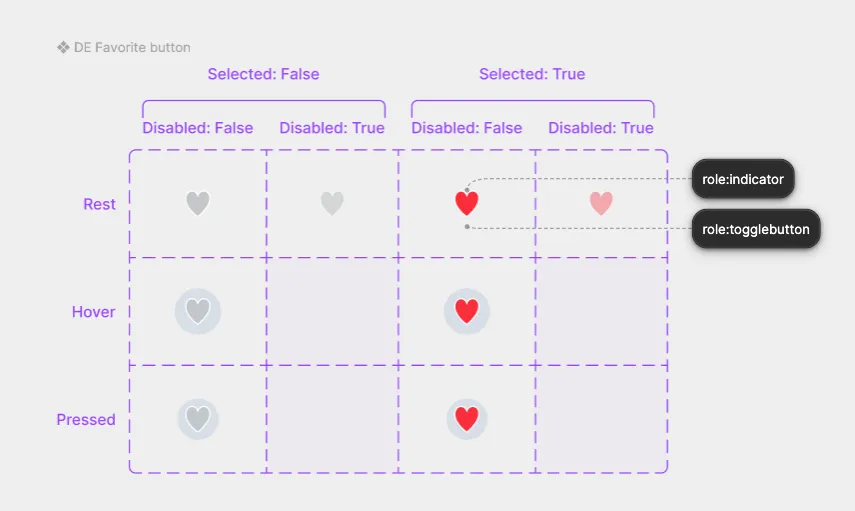
The matrix has three axes, and only two of them are props. State is styling, and the empty cells where a disabled control would be hovered are what invalidPropCombinations records — a combination the design never drew, so nothing downstream should invent it.
metadata.ts
Emitted only when the component has slots. It declares slot shapes and the rule that governs each slot’s visibility — the same rules the scaffold compiles into conditionals, kept readable for tooling that reasons about the component without parsing JSX.
export interface CheckboxSlots {  label: string;  helpText?: string;}
export type CheckboxSlotVisibility =  | { kind: 'always' }  | { kind: 'whenTrue'; prop: CheckboxSlotRuleProp }  | { kind: 'whenNotNull'; prop: CheckboxSlotRuleProp }  | { kind: 'whenNull'; prop: CheckboxSlotRuleProp }  | { kind: 'whenValue'; prop: CheckboxSlotRuleProp; value: string };
export const CheckboxSlotRules = {  label: { kind: 'always' },  helpText: { kind: 'whenNotNull', prop: 'helpText' },} satisfies Record<keyof CheckboxSlots, CheckboxSlotVisibility>;
This is not part of the props API. A consumer writes CheckboxProps; metadata.ts is for code that generates, validates or documents.
api.ts
Web Components only, and only on a root component. The custom-element surface that has no React equivalent: the tag name, the shadow-root elements a consumer may reach with ::part(), and the global element-tag map entry that makes document.querySelector('ui-checkbox') typed.
export const CheckboxTag = "ui-checkbox" as const;
/** Shadow-root elements a consumer may target with `::part()`. */export const CheckboxParts = [  "labelContainer",  "label",  "helpText",  "checkbox",  "box",  "check",] as const;
export type CheckboxPart = (typeof CheckboxParts)[number];
declare global {  interface HTMLElementTagNameMap {    "ui-checkbox": Checkbox;  }}
Props and defaults stay in contract.ts, which both targets read — api.ts carries only what is element-specific. A subcomponent has no api.ts of its own: its tag is namespaced by its parent, so the parent’s file carries it.
See Also
- Scaffold — how the contract is consumed at render time
- Stories — the enums become Storybook controls
- Prop Naming — how a Figma variant property becomes a prop name and type