Scaffold
The renderable component — scaffold.tsx for React, scaffold.ts for Web Components. It imports the contract and the stylesheet, renders the merged layout tree as BEM-classed markup, and gates each element on the visibility rule its spec declares.
It is regenerated on every run. An implementation you own goes in a sibling component.tsx / component.ts, which no command writes and the stories import in the scaffold’s place when it exists.
The examples below are a fully annotated component — a text input with a states convention configured and a textbox role on its value container. That is the richest form the file takes; what changes the output at the end of this page says which input is responsible for which part, and what is left when one of them is absent.
React
// Generated. Do not edit — regenerate with `specs react`.import * as React from 'react';import './styles.css';import { TextInputDefaults, type TextInputProps } from './contract';import { definedProps, restProps } from '../../_runtime';import { FormLabel } from '../FormLabel/scaffold';import { FormErrorMessage } from '../FormErrorMessage/scaffold';
export interface TextInputScaffoldProps  extends TextInputProps,    Omit<React.ComponentPropsWithRef<'div'>, keyof TextInputProps | "className" | "style" | "onChange" | "onBlur" | "name"> {  /** Fires on every keystroke, after the value updates. */  onChange?: (e: React.ChangeEvent<HTMLInputElement>) => void;  /** What happens on blur — typically validation — is the consumer's. */  onBlur?: (e: React.FocusEvent) => void;  /** Form submission identity. */  name?: string;  /** Merged onto the root, so a caller can place and size this component. */  className?: string;  style?: React.CSSProperties;}
const TextInputOwned = [  "state", "disabled", "focus", "readOnly", "validation",  "value", "placeholder", "startIconName", "endIconName",  "accessibilityLabel", "name", "maxLength",  "onChange", "onBlur", "className", "style",] as const;
export function TextInput(props: TextInputScaffoldProps) { const p = { ...TextInputDefaults, ...definedProps(props) } as TextInputScaffoldProps; const rest = restProps(props, TextInputOwned); const controlId = React.useId(); const descriptionId = React.useId(); const errorMessageId = React.useId(); const valueProp = p.value ?? ''; const [value, setValue] = React.useState(valueProp); const [prevValue, setPrevValue] = React.useState(valueProp); if (prevValue !== valueProp) { setPrevValue(valueProp); setValue(valueProp); } p.value = value; return ( <div className={['text-input', p.className].filter(Boolean).join(' ')} data-element="root" {...(p.disabled ? { 'data-disabled': '' } : {})} {...(p.readOnly ? { 'data-read-only': '' } : {})} data-validation={p.validation} {...rest} style={p.style} > <div className="text-input__form-label" data-element="formLabel"> <FormLabel {...{ required: false, label: "{Label}", helpText: "{Help text}", size: "medium", disabled: false }} htmlFor={controlId} descriptionId={descriptionId} /> </div> {p.startIconName != null && ( <span className="text-input__start-icon" data-element="startIcon" aria-hidden="true">{p.startIconName}</span> )} <input className="text-input__container" data-element="container" id={controlId} type="text" value={value} onChange={(e) => { const next = e.target.value; setValue(next); p.onChange?.(e); }} placeholder={p.placeholder ?? undefined} disabled={p.disabled} readOnly={p.readOnly} aria-invalid={p.validation === "error" ? 'true' : undefined} aria-describedby={[descriptionId, p.validation === "error" ? errorMessageId : null].filter(Boolean).join(' ') || undefined} name={p.name} maxLength={p.maxLength} onBlur={p.onBlur} /> {p.endIconName != null && ( <span className="text-input__end-icon" data-element="endIcon" aria-hidden="true">{p.endIconName}</span> )} {p.validation === "error" && ( <div className="text-input__error-message" data-element="errorMessage"> <FormErrorMessage {...{ label: "{Error text}", size: "small" }} errorMessageId={errorMessageId} /> </div> )} </div> );}| Emitted | Why |
|---|---|
{ ...Defaults, ...definedProps(props) } | An explicitly passed undefined must not beat a default; definedProps drops those keys before the merge |
restProps(props, Owned) | Everything the component does not own — id, onFocus, data-testid — passes through to the root |
className merged, not replaced | A caller places and sizes the component without losing its own class |
data-<prop> on the root | What the stylesheet’s variant selectors match. A boolean prop emits presence, an enum emits a value |
{p.x != null && …} | The slot rule from metadata.ts, compiled into a conditional |
aria-hidden on a decorative element | A glyph beside a labelled control adds nothing to the accessible name |
<input type="text"> in place of a <div> | The textbox role names a native control, and React can replace the tag with it |
value / onChange / useState | A native input is stateful; an uncontrolled one would ignore a value prop after first paint. The prevValue comparison re-syncs when the prop changes, without an effect |
disabled, readOnly, maxLength as real attributes | The native element enforces them — blocking events, excluding the field from submission — rather than announcing them with ARIA |
React.useId() per wired element | htmlFor and aria-describedby need matching ids on elements the spec knows only as anatomy names |
htmlFor / descriptionId passed into FormLabel | The label is a separate component; the pair is wired across that boundary rather than assumed to be one element |
aria-describedby accumulating the error id | Only while validation is in error, so the description is announced exactly when it is shown |
Source
The same component in the two surfaces it passes through before any of that exists.
Specs
Everything above is derived from api.yaml, which specs generate writes. The anatomy block is the layer tree with its roles; props (not shown) becomes the contract.
anatomy: root: type: container formLabel: type: instance role: - label - description - indicator instanceOf: formLabel container: type: container role: textbox startIcon: type: glyph role: indicator value: type: text role: value placeholder: type: text role: placeholder endIcon: type: glyph role: indicator formErrorMessage: type: instance role: errormessage detectedIn: State=Rest, Validation=Error instanceOf: formErrorMessage| Field | What the scaffold does with it |
|---|---|
| The key | The data-element value and the BEM class suffix — container becomes .text-input__container |
type | Whether the element renders as a container, a text node, a glyph, or a call to another component |
role | The element emitted in its place, and the wiring around it. A list means one layer carries several |
instanceOf | Which component’s scaffold to import and call |
detectedIn | The variant this element was found in — which becomes the conditional that shows it |
Layout, spacing and every styled property are in variants.yaml, and go to the stylesheet rather than here. The scaffold takes structure; the stylesheet takes appearance.
Figma
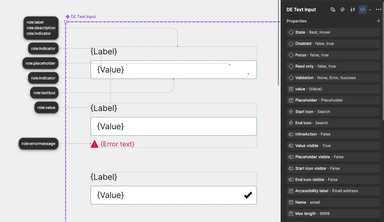
Two annotations, doing two jobs. The badges name what each layer is — a layer called Container is a textbox, one called Value is the value it holds. The properties panel is the variant and text properties, which become the props.
Neither is inferred, and that is the point. A layer named Container could be anything; the badge is what makes it an <input> three steps later.
Web Components
The same layout tree, adapted to Lit. The custom element is the root, so the host carries what React puts on a root <div>, and children are declared as parts so a consumer can reach them through the shadow boundary.
// Generated. Do not edit — regenerate with `specs webcomponents`.import { LitElement, html, css, unsafeCSS, nothing } from 'lit';// @ts-ignore — vite resolves `?inline` to the stylesheet textimport styles0 from './host.css?inline';import './light.css';import { TextInputDefaults, type TextInputProps } from './contract';import '../FormLabel/scaffold';import '../FormErrorMessage/scaffold';
export class TextInput extends LitElement {  // The shadow root contains a real interactive element; delegating focus  // makes the host a real tab stop and keeps `:host(:focus-visible)`  // matching, so the stylesheet needs no knowledge of the inner element.  static shadowRootOptions = { ...LitElement.shadowRootOptions, delegatesFocus: true };
  static styles = [    css`@layer specs { :host { display: block; } }`,    unsafeCSS(styles0),  ];
  static properties = {    validation: { type: String, reflect: true },    disabled: { type: Boolean },    readOnly: { type: Boolean, attribute: 'read-only' },    value: { type: String },    placeholder: { type: String },    startIconName: { type: String, attribute: 'start-icon-name' },  };
  declare validation: TextInputProps['validation'];  declare disabled: TextInputProps['disabled'];  declare readOnly: TextInputProps['readOnly'];  declare value: TextInputProps['value'];
  constructor() {    super();    Object.assign(this, TextInputDefaults);  }
  willUpdate() {    this.setAttribute('data-element', 'root');    { const v = this.disabled ? true : null; if (v == null || v === false) this.removeAttribute('data-disabled'); else this.setAttribute('data-disabled', v === true ? '' : String(v)); }    { const v = this.validation ?? null; if (v == null || v === false) this.removeAttribute('data-validation'); else this.setAttribute('data-validation', v === true ? '' : String(v)); }  }
  /** Fires on every keystroke, after the value updates. */  onChange?: (e: Event) => void;
render() { return html` <div class="text-input__form-label" part="formLabel" data-element="formLabel"> <ui-form-label .label=${"{Label}"} .size=${"medium"} htmlFor="control"></ui-form-label> </div> ${this.startIconName != null ? html` <span class="text-input__start-icon" part="startIcon" aria-hidden="true">${this.startIconName}</span> ` : nothing} <input id="control" class="text-input__container" part="container" type="text" .value=${this.value ?? ''} placeholder=${this.placeholder ?? nothing} ?disabled=${this.disabled} ?readonly=${this.readOnly} aria-invalid=${this.validation === "error" ? 'true' : nothing} @input=${(e: Event) => { this.value = (e.target as HTMLInputElement).value; this.onChange?.(e); }} /> ${this.validation === "error" ? html` <div class="text-input__error-message" part="errorMessage"> <ui-form-error-message .label=${"{Error text}"}></ui-form-error-message> </div> ` : nothing} `; }}| Emitted | Why |
|---|---|
reflect: true on variant props | The stylesheet selects on the attribute, so the property must write it back |
attribute: 'read-only' | A camelCase property needs an explicit kebab attribute name |
Object.assign(this, Defaults) in the constructor | Lit has no props-merge step; defaults are assigned once at construction |
part="…" on every anatomy element | Shadow DOM hides these; part is the only way a consumer styles them. The list is in api.ts |
@layer specs { :host { display: block } } floor | A custom element is display: inline by default. Layered so the sheet’s own layered rules still win |
willUpdate() writing host attributes | The host has no JSX to carry them; they are set imperatively before each render |
nothing, not '' | Lit removes the node or the attribute rather than rendering an empty one |
.property=${…} on a child tag | A subcomponent takes objects and booleans as properties; attributes are strings |
delegatesFocus | The shadow root holds a real control. Delegating focus makes the host a tab stop and keeps :host(:focus-visible) matching, so the stylesheet needs no knowledge of the inner element |
data-disabled on the host, not aria-disabled | The native attribute lives on the inner input, out of reach of :host(), and a host is not a form control — so the host carries a plain styling attribute instead. See precedence |
| Ids local to the shadow root | The root is its own id scope, so a wired pair needs no generated id — unlike React, where the document is shared |
Subcomponents
A composed element renders as a call to its subcomponent’s scaffold, with the props the parent’s variant data pins. React passes them as spread objects and imports the function; Lit imports the module for its side effect — defining the tag — and passes .property bindings. Either way the child comes from its own directory, so a change to the child’s contract is a compile error in the parent rather than silent drift.
When a role spans that boundary — a label in one component describing a control in another — the parent owns the wiring and passes ids down as explicit props.
What changes the output
Four inputs shape the file, each in a different place. The examples above have all four; here is which part each one is responsible for, and what remains without it.
| Input | Responsible for | Without it |
|---|---|---|
| Variant data | The merged layout tree, every conditional, and the data-* attributes on the root | A component with no variants.yaml is skipped rather than emitted empty — there would be nothing to gate on |
| states convention | aria-invalid, aria-required and their peers, in place of a data-* attribute | Every variant prop stays a data-* attribute. The component still renders and still styles |
| Roles | The <input> replacing a <div>, the value state, the native disabled/readOnly/maxLength, the id wiring, and the event props in the contract | A <div> container with ARIA, and no role-derived props — a correct component, not a native control |
| The licence | Roles and actions, plus composition, glyphs and background images | Free output is what the spec would emit unannotated. Less in it, nothing wrong in it |